KPI-driven approach
Configuration
Building a model

Before building the AD model using a kpi-driven approach, a user can adjust the following configuration settings:
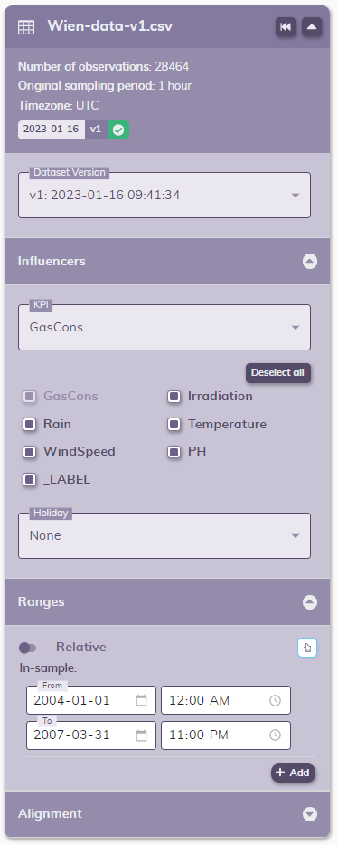
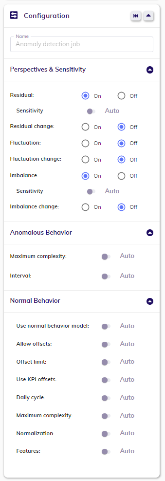
For more in-depth information about configuration, please see here.
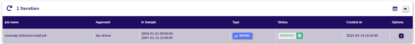
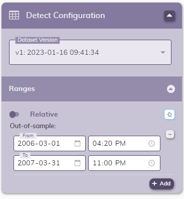
Detecting with/Iterating from a previously built model
When your model is sucesfully finished, you can use it for detection or you can iterate from it to fine-tune the configuration and build a new one.

Before detecting, a user can adjust the following configuration:
When iterating, a user can adjust exactly the same as when building a model.
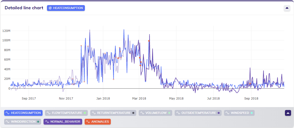
Results
The results in the line chart(s)
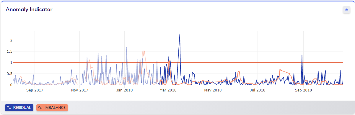
For anomaly detection, the anomalies are part of those results. The anomalies are linked to the anomaly indicators in the Anomaly indicators line chart: a user can select the perspectives they would like to see in that chart, and both the indicators and the anomalies will update accordingly. The results also include the normal behavior: how the target would have been expected to behave, had it not had any anomalies. These results are applicable for both model building and detection jobs.
Root-cause analysis (RCA)

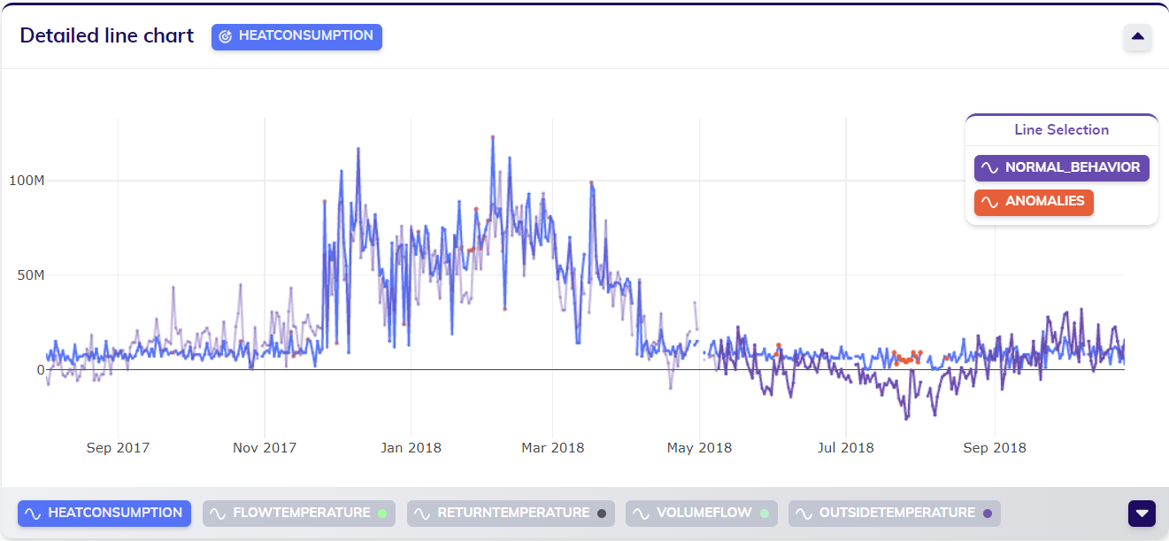
When looking at the results of an anomaly detection model building job, the RCA icon ![]() can be found in the actions at the top right of the detailed line chart. By clicking this icon, the user activates RCA on this job's results, allowing the user to drill down the root cause bringing TIM to produce a particular result.
can be found in the actions at the top right of the detailed line chart. By clicking this icon, the user activates RCA on this job's results, allowing the user to drill down the root cause bringing TIM to produce a particular result.
To perform root-cause analysis on a specific value, the user should click on the value - the point in the line chart - that they are interested in. The timestamp of this selected value can possibly be linked to multiple results, such as normal behavior and detected anomalies. Selecting a timestamp will open up a line selection pop-up as shown below, allowing the user to select the specific result that they want to inspect. Clicking on the desired option triggers an ML request specifically for RCA, of which TIM Studio will then show how the calculation progresses.
After the results have been calculated and processed, the user can continue by interpreting the results. The RCA results are displayed in a pop-up, as shown below. This pop-up is composed of multiple parts, each of which is explained below the visual example of results.
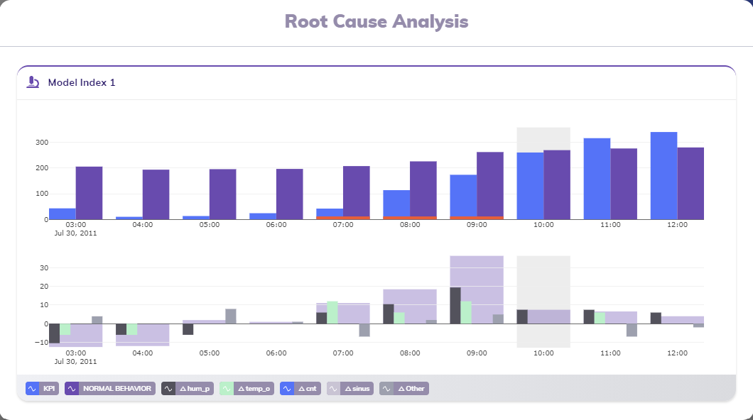
The RCA card's title indicates the model that was used to generate the result the user is looking into. In the example above, the model with index 1 was used to calculate the result that is being analyzed.
The visuals inside the RCA card explain the change in normal behavior by showing it is composed of changes in predictors. A grey area indicates the active timestamp that was selected when triggering the RCA calculation.
The bar charts
The RCA card in the example above shows two bar charts: one for the KPI and normal behavior and one for the decomposition of the change in normal behavior into changes in predictors. This section discusses both charts.
The top bar chart displays the KPI and normal behavior grouped by observation. This allows users to see how much the actual behavior differs from what the model expected, and also provides a way of comparing changes in both KPI and normal behavior from one observation to the next. The red horizontal bars right on top of the x-axis for some observations (the fifth, sixth and seventh in this example) indicate that that observation is detected as an anomaly. Furthermore, a grey marked area indicates the observation of the active timestamp that was selected when triggering the RCA calculation (the eighth observation).
The lower bar chart breaks down the change in normal behavior between the previous observation (t-1) and the current observation, thereby explaining the consituent of a decrease or increase in normal behavior. To keep things orderly, the for most contributing features in the model in focus are shown as the for first bars for each observation; all other features' contributions are summed together and visualized as a fifth Δ Other bar. Behind the grouped bars of each observation an area is added, showing to how much these contributions add up; the height of this broad bar represents the same value as the difference between the previous observation's normal behavior and the current observation's normal behavior. Again, a grey marked area indicates the observation of the active timestamp that was selected when triggering the RCA calculation (the eighth observation).
The legend
The footer bar of the RCA card contains the legend of the lines shown in the different line charts. Apart from indicating the KPI and the normal behavior, the legend also provides a way to see what those most contributing features are that are included in the lower grouped bar chart.